WELCOME!

It is hard to believe that it was almost ten years ago I witnessed a CNC router in action for the very first time. I was fascinated and simply had to have one! Although I had been in the creative end of the three dimensional sign business for most of my life I didn't really know what I would do with one of these machines - but I just knew it could do fantastic stuff.

Along with the CNC router I discovered the wonderful material called Precision Board and the glues, primers and other companion products they offer. Since then we have gone through many tons of the material using it in most signs and projects we tackle. This journal will chronicle our many adventures both past, present and future. I'll talk from the perspective of someone who pushes these products to the creative limit on a daily basis. I'll be adding to the stories two or three times each week. -dan

Friday, January 28, 2011

Three dimensional challenge

Our next project is one I've been looking forward to for a while. The sign is for an upscale restaurant in a beautiful new brick building that looks to be a hundred years old. The sign shape and details were inspired by the cast iron windows which were imported from a building salvaged in Paris. Our job will be to build a 3D routing file that will duplicate this look.  We may use the same file to produce the window trims for the inside decor. The knight will duplicate (in miniature) a larger piece inside the restaurant. The bracket will be hand forged in our shop. It too reflects the style of some of the trim we will do inside the restaurant.


The sign is to be routed from 30 lb Precision Board in layers and then assembled. It will be double sided and measure 4' wide x 5' tall x 12" deep.  


It will be midweek before I get a chance to build this file and send the project to the MultiCam. In the meantime take a close look at the concept and think about how you would tackle this project if it came to your shop. Next week I'll show you our way of doing it.

-dan

Tuesday, January 25, 2011

Same logo - different challenge!

My customer want dimensional logos in a variety of places and sizes for his display. One will be on a dimensional sign overhead and one will be routed as an insert for the door. No doubt there will be more made for other purposes in the future too. But these were to be routed as comparatively shallow reliefs. The first file was to be about 36" across and 2" deep. So it was back to the original file to see what we could use this time. I  decided most the the vectors were usable with the exception of the starburst. It would be too fragile as a routed file. 


The hills/clouds were resized and tweaked to make sure they were bigger than the circle. Then I substituted the sunburst I had created for the diorama, resized it, and then using the jigsaw puzzle tool cut it out to the right shape.


The I created a bowl shaped relief using the circle vector. This relief was modified four time using the three hill/cloud shapes and the starburst. I added .15" of depth each time.


Then it was time to add the trees. The tree tops were simple reliefs which were toggled to the right height using the arrow keys in the bottom view. The tree trunks were rounded reliefs which were then modified using the vertical bark vectors to create  .15 difference in height. 


They tapered nicely but I needed to tip them into the center of the picture. In our workshops I've seen Jeff Hartman do this in seconds... but I couldn't remember how he did it. I struggled for a while before I decided to do it my way instead.  I created a vertical blend in PhotoShop and imported the bitmap file into EnRoute. I resized it to suite and then used it to modify the tree reliefs. I applied a value of .75" meaning the black would do nothing, the white would change .75" and the grays would be somewhere in between. It effectively tipped them just what I needed. Then, using the down arrow key in the side view I pulled the trees down into the picture just the right amount.


This side shop is of the file after I tipped the trees using the bitmap file. The difference in height where the bottom of the bitmap file was is very obvious. This will be cut off when I merge the files to the round disk.


Then I merged everything together and the file was ready to tool path. My customer is bringing me the door tomorrow with a hole already cut into it. I'll measure carefully, then resize my file and send it to the MultiCam. 


The file will take a little handwork to finish, especially at the top of the tree and perhaps a little die grinder work in the sides of the tree trunks. But with only a few minutes of work by hand the logo is scaleable and relatively quick to do.

-dan

Monday, January 24, 2011

Sonbuilt 3D logo build finish

This morning I put the last color of glaze on the foreground trees to finish the Sonbuilt logo. It came together quickly. My client is anxious to try out the waterfall but that will have to wait for a few days while the paint cures. The piece is off to the cabinet makers this morning to have the lectern built around it.


The trade show setup is Thursday - about the time the paint will be cured properly. Then we'll fill the well with water and turn on the pump for the first time. What could possibly go wrong?  :)

I've edited this post to include the original artwork designed Curtis Cottrell which we started with to show how dramatic this nice flat art can become when another dimension is added.


-dan

Sunday, January 23, 2011

Routing bits for texture files

A question I often hear concerns the routing bits I use for our textured projects. For most of my projects I use two cutting tools. A 3/8" ball nose bit is used to rough out most of our projects unless they are really large. Generally I use this tool with a 0.1" offset and a 50% overlap. I make as many passes as necessary, most often not taking a deeper cut than 1" per pass. 


For the detail cuts I make one final pass with a 1/8" ball nose bit. For a long while the biggest limitation on my designs was when an edge of my project was deeper than the cutting flutes on the bits. The smaller the bits, the more it limitations it imposed on my design. Then they invented the taper tools. The bit I use most often had a 1/4" shank and tapers down to the1/8" ball nose end. I can get these bits with the flutes going up the shaft up to a 1 1/2" depth. The angle of the taper is slight - only 1 degree, meaning it is not noticeable.

To get the router to make only one detailed pass I purposely enter false information when I input the tool data. I tell the machine the cutting edge is longer than the material depth. The reality is that because of the rough pass with the 3/8" bit I am seldom removing more than 0.1" of material. The only critical depth is the larger vertical areas which now can't be more than 1.5". This final pass is done with a 75 - 90% overlap depending on the final finish I want to achieve. For the material we use most often, 30 lb Precision Board, an 80% overlap is sufficient.

-dan

Saturday, January 22, 2011

Sonbuilt 3D logo build part 8

This little project has proven to be very challenging and fun. The design of the logo was done by someone else. It looked great in print. My challenge was to create it in three dimensions. With the extreme angle of perspective of the piece the key was to limit the angle of viewing. We did this by cutting a hole in the cabinet and dropping the scene back into the box. 


Today I began applying the colors. My client had asked me to ‘make it real while respecting the limited palette of colors they had used on the original logo. The trick is the scene has to be painted in stages from front to back. Once I get to the front there will be no going back as access will be limited because the foreground trees will be permanently fixed before I can paint them. It comes down to using my experience and imagination to make the call of when it is done.

It is amazing how adding each piece changes the look in such a profound manner. It is important to keep the pieces handy to check how it will look when it is done.


Taking pictures of the progress and looking at them on the screen gives me a more objective look on things. I believe a couple more washes of browns will put us in the ballpark before I proceed with the big foreground trees. Meanwhile the tight deadline quickly approaches.  :)

-dan

Thursday, January 20, 2011

Sonbuilt 3D logo build part 7

Today I spent an enjoyable afternoon sculpting details on the Sonbuilt sign. It brought back memories of work I did decades ago when I made my living as a pen and ink artist I did a series of drawings of the many small waterfalls I saw in my travels. I remember the painstaking effort it took to draw the many leaves on the bushes and in the details like the fallen logs.

Fast forward 30 years. These days I still spend some time drawing out my ideas, but then go into the workshop to make the projects in full three dimensions. As I formed little balls of epoxy sculpting medium and applied them one by one to the sculpture it brought back pleasant memories of the time I spent a my drawing table so long ago.

It gave me pleasure to be recreating one of those scenes I discovered back when I was on the road promoting my pen and ink art. I was reminded once again how things we do in our youth often prepare us for things we choose to tackle later in life. The more things change, the more they are the same.


We made good progress this afternoon, finishing a little more than half the background. After we finish the other half I'll have to paint it before putting in the foreground trees. Doing it in that fashion will make things a whole lot easier.


Stay tuned for more progress.

-dan

Wednesday, January 19, 2011

Sonbuilt 3D logo build part 6

From here on it will be sculpting and painting but before I got into things too far I decided to mock up the trees in front to make sure we were achieving the look of the original logo artwork. My concern was how it would look with the severe upwards perspective with the new artwork we will be sculpting in. I think it is looking pretty good. The waterfall will be sculpted to be a series of small waterfalls, trying to make the water tumble as much as possible. I think I'll fork the falls to make them appear between the trees as much as possible. It should come along pretty quick now.

-dan


Tuesday, January 18, 2011

Sonbuilt 3D logo build part 5

Often in our line of work we get to wear a number of hats. This project is no exception. Designer, sculptor, programmer, engineer, plumber, electrician, painter, and probably a few more. But that is what keeps this job so interesting!  

Once the file came off the CNC router it was time to use some old fashioned tools. I trimmed the background piece down to size with the table saw, then cranked the blade over to forty-five degrees and cut the back sides at an angle. A sawzall whacked out the hole for the pump and trimmed the bottom corners away to make room for the wiring. Then I drilled a hole through the middle and a groove in the back to accommodate the low voltage LED wiring. 

Then it was time to play plumber. I had a whack of PVC pipe and fittings left over from previous projects, so I didn't have to go to the store for that. A ball valve was first to regulate and throttle down the water flow as necessary. Then I used angle fittings to drop the pipes down and around to where the water would come out. I flattened the pipes by heating them up a little before shaping them. 


A bit of sculpting epoxy fastened the LED lights in place and made it easy to angle them slightly towards the background. Then I cut an opening in a piece of 30 lb Precision Board to form the top of the display. The hole in the center will be the 'lake into which the water falls. The submersible pump will be under the water.


Now the hard part is done and the fun stuff begins.


To check how it will appear when the logo sits in the finished cabinet I cut a hole in a piece of MDF which I'll prop up in from when I need to.


It's coming along nicely and tomorrow we should get a good start on the scenery.

-dan

Monday, January 17, 2011

Sonbuilt 3D logo build part 4

I put the file on the MultiCam this morning. I wanted to route it from 3" Precision Board in one piece since I didn't want to deal with glue seams through the sunburst rays. The only piece I had in stock was 40 lb board and the sheet weighed in at a hefty 320 lbs in total. I like to think I'm tough, but I'm really not. It was far too heavy for me to lift by myself and finally, after all these years, I'm smart enough to know it. I had no one else scheduled to come in and my neighbor wasn't home. After some head scratching I got out the sawzall and cut a 3' piece off the sheet. It still clocked in at over a hundred pounds but I managed to wrestle it into the router room and onto the table.


Because of the depth I decided to do the rough cuts in three passes - probably overkill but I didn't break the bit either. :)  For the finish pass I used a tapered 1/8" ballnose bit. I could have lied to the machine and told it the bit was longer to accomplish the cut in one pass but it was easier and quicker to start the first pass, then stop the machine and do a proximity restart at the edge of the first pass and go almost straight to the final pass. That is why the edge of the final cut is done while the router is still working from the center. I'll stop the router as soon as we get to that point.

Tomorrow I'll start in on the other pieces of this jigsaw puzzle and it should start looking more like the logo we want to emulate shortly.

-dan

Sunday, January 16, 2011

Sonbuilt 3D logo build part 3

This morning when I took a look at the file the deep edge just over the clouds bothered me. Keeping it even with the top edge of the board used up a lot of valuable depth real estate, which I would need to create the waterfall. The depth of the cut would also be problematic as the bit I intended to use simply wasn't that long. I could do a maximum of 1.5" on that cut. It needed to be fixed. 

The solution was to crete the clouds as a separate relief, then dish it in using an oval vector ) as I had done with the starburst background.


Once I had floated the relief to the right height I them merged then together using the 'merge highest' command.


The end result was a file that could easily be handled with the bits I use. It was now ready to tool path and send to the router at last.

-dan

Saturday, January 15, 2011

Sonbuilt 3D logo build part 2

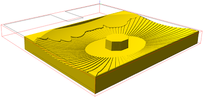
After thinking about the file I had created for an hour I decided to make one small modification. I created an eight sided post in the middle of the starburst. The eight sides would hold the LED lights and the post would support the top of the tree. I decided it would be simpler to route it as part of the original file than to build it later. The material was going to wast anyways. It will be routed from a 3" thick block of 30 lb Precision Board so there are no seams.


Normally this is the kind of thing I think of far too late Maybe experience is making me wiser. We can only hope.

-dan

Sonbuilt 3D logo build part one.

Sometimes what seems like the simplest of ideas can turn into a most challenging project. Our client, Sonbuilt Custom Homes had a nice logo, done by someone else. The idea was to create a lectern to be used at trade shows and as a display piece in the office. But we were going to ramp things up a little. It would be in a shadow box, fully 3D with LED back lighting and a waterfall with real water. The box would measure 32" x 32" x 16" deep. My client would build a watertight  aluminum enclosure and do the fancy woodwork around it. We would do the logo as an insert. Thankfully he had vector files which I thought would save me a bunch of work.


Once I opened the vector file I found it was a jumble of lines. It looked great in print but was not very useful for our purposes. It made me scratch my head for a few days as I puzzled it out. After separating the many elements I decided only the sunburst was usable and that needed to be heavily modified before we could create a routing file.


Once separated the vector sunburst looked like this. If I created a file using this vector the points of the star would be far too fragile to be practical.


So using the offset tool with radius corners I first offset to the outside, deleted the original, then offset to the inside. Then I tweaked each ray of the sunburst to a smaller radius on the inside and out to the edge of the piece on the outside. This was cut on the bottom to the shape of the clouds.


Then using the shape of the piece I wanted to route I created the basic relief. This would be modified using an oval vector of the right dimensions


Once I modified the original relief using the oval shape it looked like this.


 Then I used the starburst vector to modify the relief once more to create the background for the logo. 


Finally I created a vector that would be used for an offset cut. This would be used to cut out the piece. The file was now ready to tool path and then send to the router.


Stay tuned to see how it routes and then is assembled for the lectern.

-dan


Friday, January 14, 2011

Almost complete!

Back before Christmas we started this project. It's been coming along, slowed by the holidays some. Today Bec finished the bulk of the painting today with just a few details to go on the bees before we declare it done. I love how the cool colors of the letters pop against the warmer colors of the background. this sign should work well for our client. It's hard to see in this picture but it is double sided. it stands just a hair over eight feet tall in total. With all the various components, this project proved to be a little more difficult than I imagined it would be but we are very pleased with the result.


The 'wood' post is sculpting epoxy over a welded steel structure. The lettering and honeycomb were routed from 30 lb Precision board. The colored, translucent panels are vinyl covered Lexan. If you want to see the rest of the posts in this series just go to the archives on the right and click on 'Glass Hive Signs'.

-dan

Thursday, January 13, 2011

Finishing the edges of our signs

One of the many things that separates our sign shop from most out there is how we take a little extra time and effort to finish the edges of our signs. Our signs are dimensional - wildly so. This means they have four sides by which they may be viewed.  On the meat market sign we are currently doing, the edge of the sign is cartoon woodgrain - like the front. I could have created a router file to machine some wood grain which would have meant only a little hand work to blend the pieces at the corners. I've done it that way with good results previously. But in this case it was just as easy and probably faster to create the woodgrain texture on the edges by hand with an air powered die grinder. It only took a few minutes to do.


The end result is noticeable but subtle if done right. It adds value to a project without adding hardly anything in cost. It is one more way to separate ourselves from the pack.

-dan

Wednesday, January 12, 2011

Nose ring it is!

I had posed this question on a couple of forums and on our facebook page...  the jury is in. Luckily the owners of the sign also weighed in with their opinion. Almost all (including the owners) wanted to see a nose ring. No problem. Nose ring he now has.  :)


-dan

Tuesday, January 11, 2011

To ring or not to ring???

We are now into the hand finishing stage of the sign as all the machining is done. One of he bull's heads is almost done. There is a debate raging in our shop right now as to whether we should put a brass ring in his nose or leave it as is...  Any opinions??


-dan

Final photos of boardroom

Yesterday I finally was able to take the last of the pictures of the MultiCam boardroom. It was tricky to photograph as I simply didn't have a wide enough angle lens. I ended up taking multiple shots and then using a very cool function in PhotoShop melded them together magically. The room appears a little larger than it actually is. It measures 16' x 24'. The photos were taken with my back pressed into the corner.


The room is best experienced in person as the photos simply can't do it justice. I you are ever in the area drop in for a look. I'll take the time to give you a tour and talk about how cool EnRoute Pro and the MultiCam routers really are and how we made all the pieces.


-dan

Friday, January 7, 2011

Sign passes first test!

Today we squeezed in some time to work on the Meat cutter's sign. I welded up a 1.5" x 1.5" square tubing frame with some sturdy eye bolts on the top.  I clamped the sign face to one side of the structural steel frame and then cut scrap blocks of 1.5" Precision Board around it. These were glued with PB Bond-240 and then screwed securely.


Then I hoisted the second side into place and fastened it to the back side. I hadn't yet started in on the sculpting of this bull.  We'll do that tomorrow.


The sign is starting to look pretty cool and it is going to be a good size when it's done, measuring about 4 feet wide by 4' tall and an amazing 4 feet thick. THIS is a dimensional sign! The sculpting of the bull on this side is almost done with only a little on his chin, the hair on the top of the head and the horns to go. I'll be in touch with the owners tonight and see if I can convince them he needs a nose ring - just for fun. 


Today we had a new customer from Utah come through our shop. As soon as they came through the door they gravitated to the bull sign. He pulled a camera from his pocket and asked if he could take a picture. I agreed. It made me smile for in doing so the sign passed it's first test. The test is simple. Before we finish installing a sign, someone, not connected to us or the owner, has to take a picture of the sign we build. I can't remember any that haven't. It means the signs we make are memorable and are doing their job. And doing it beyond simply being there. Each time the photos are looked at the sign is working again - wherever that might be. THAT is an effective sign!


-dan

Wednesday, January 5, 2011

More fun

One of my favorite things about my MultiCam router is that it does it's work unattended - while I do other things. Late last night I started this detailed file - then went to bed. I slept good too! This morning when I came in to check it was just finishing up the file. That is the definition of convenience and ease!


Sarah came in just before noon today and in less than three hours we made pretty good progress on the bull's head sculpt.  A heavy steel rod goes through the head and into the horns to make sure they stay put for a life time.


The bull's head was fastened securely from the back of the sign. I'll weld up a steel frame to laminate the front and back sides over and then finish the sculpt in place. It is always best to sculpt as it will appear finished if possible to get the proportions right - even for a cartoon. The funny groove in the horizontal piece of the sign was a routing mistake. I accidentally called up the wrong file as they were named very similar... but no real harm was done as the top piece will laminate over it before we are done . by the end of the week this side of the sign should be almost ready for paint!


One thing for sure about this sign... it is going to be HEAVY! The wind shouldn't bother it too much.

-dan

Tuesday, January 4, 2011

BULL'S EYE!


 Last night we got the go signal from a new client. They had visited our shop last month, liked what they saw and asked me to design a new sign for their meat cutting business. They asked for a dimensional bull's head as their mascot.I did up a design and sent it off to them. They liked the concept but asked for two small changes. The bull needed to be a little meaner and the lettering needed to be a bright shade of yellow.


I did up the changes in a hurry and sent the artwork on it's way one more time. The response was immediate - BULL'S EYE!


The next step was to figure out just how the bull would look from the side. I threw a piece of tracing paper over a printout and did a quick side view sketch in scale. He looked just as mean from this angle!  


Then I pulled my design into Illustrator and whipped up the vectors I needed for the sign. These were imported into EnRoute pro and the design process began for real. The front view of the head was only for reference sake as I wouldn't be creating a relief from this angle. The bull's head to the left was used to cut eight 1" pieces of Precision Board which I screwed together to make two heads. 


The main body of the sign was to be routed from 2" 30 lb Precision Board. Since the sign measures 4' x 4' it needed lots of depth. The horizontal pieces will be laminated on top and are to be cut from 1.5" Precision Board. For the wood grain relief I used my cartoon woodgrain bitmap with a depth of .3".


Because the shape of the sign is not the same on both edges it is important to build the text reliefs as a separate item from the sign face. I created a copy of each and then flipped the sign face before merging everything together. In this way the front and back of the sign will fit together perfectly.


Since the whole head would be covered with sculpting epoxy I screwed the pieces together pretty rough. I used some scraps I had lying around to create the bulky nose and top of the head. Then I scrunched up some tinfoil to bulk our the nose a little more.  If you look at the photo closely you will see Sarah in the background mixing the sculpting epoxy for me. It takes just as long as the sculpting process.


I only worked on the sculpture for about an hour today. I wanted to bulk things out a little - not worrying about any details at this stage.  The head is quite large as you can see by the spray bottle beside it.


The background pieces for the sign are on the MultiCam router now and will run through the night. Tomorrow some real progress will be made on this project.

-dan