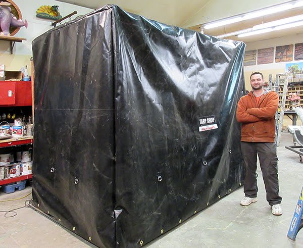
While we were attending the IAAPA EXPO in Orlando, Florida our crew stayed behind to work in the shop. They did not disappoint. Their task was to paint as many of the bowling alley arches as they could in the five work days they had. They applied the three base coats to all twelve arches and got a good start on the glazes. five arches were finished with only a little more work left on the remaining pieces. They all look fabulous! It sure is nice to have a crew we can count on whether the management is in the shop or not. THANKS!
WELCOME!
It is hard to believe that it was almost ten years ago I witnessed a CNC router in action for the very first time. I was fascinated and simply had to have one! Although I had been in the creative end of the three dimensional sign business for most of my life I didn't really know what I would do with one of these machines - but I just knew it could do fantastic stuff.
Along with the CNC router I discovered the wonderful material called Precision Board and the glues, primers and other companion products they offer. Since then we have gone through many tons of the material using it in most signs and projects we tackle. This journal will chronicle our many adventures both past, present and future. I'll talk from the perspective of someone who pushes these products to the creative limit on a daily basis. I'll be adding to the stories two or three times each week. -dan
Saturday, November 19, 2016
GREAT SHOW!
The International Association of Amusement Parks and Attractions EXPO was a wonderful success. Over the course of four days we were privileged to showcase our company to thousands of potential clients from around the world. Our presence was small this year, our first as participants in the show. The reaction to our booth was overwhelmingly positive. We were delighted to be honoured with a Brass Ring Award for Best Exhibit in our category - no small feat in a show this size.
Sunday, November 13, 2016
IAAPA set up in a flash
Last year we decided to attend the IAAPA EXPO (International Association of Amusement Parks and Attractions EXPO) as vendors. We designed a booth and built it from plasma cut steel, Precision Board and sculpted concrete. We built the display as one piece with the logic it would save time and money as we set it up. Today was the test. We got into the show area just after nine o'clock this morning and by ten o'clock were back in the hotel. Setup was that quick! Tomorrow morning we will go in for a few minutes once more to unroll the carpet and check things over one last time. The trade show starts on Tuesday morning.
Wednesday, November 9, 2016
Endless arches
Peter and I are off to Florida for the International Association of Amusement Parks and Attractions EXPO on Saturday to man our booth during the event. We will be gone for an entire week. In our absence we wanted to make sure the crew had plenty to do and that we did. Over the last couple of weeks we applied and sculpted the fibreglass reinforced concrete to fourteen arches, as well as numerous posts and beams. The crew's task is to paint all of these pieces in our absence.
Today, we put the newly sculpted pieces (done yesterday) onto their mobile racks and pulled all of the previously done pieces into the shop. It filled the shop space entirely with a little bit of walking room to spare. We then dared the crew to finish before we returned. The challenge is on!
Today, we put the newly sculpted pieces (done yesterday) onto their mobile racks and pulled all of the previously done pieces into the shop. It filled the shop space entirely with a little bit of walking room to spare. We then dared the crew to finish before we returned. The challenge is on!
Tuesday, November 8, 2016
Pub signs - final pictures
No project is complete they say until all of the paperwork is done. That of course includes documenting the finished pieces with great photographs. The pub signs won't be installed in the project until some moths down the road. Chances are the lighting won't be great and the backgrounds will be busy and cluttered. We'll get pictures then but in the meantime we needed some good ones. The solution was to set up a temporary photo backdrop (two sheets of plywood) and paint it a neutral colour. We then rolled the signs into place, one at a time and took a bunch of pictures with a good quality digital camera. These pictures were then brought into Photoshop and tweaked a little. Lighting and contrast were adjusted, and the images were cropped and adjusted so there was no keystoning. In about an hour we had images of the seven signs that were of great quality.
The Crown & Pin Pub sign is now the marquee for the establishment. Very different on both sides it still looks great from any angle.
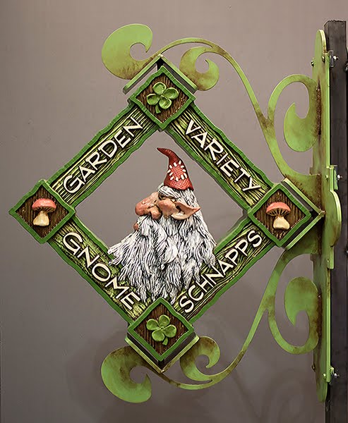
The Garden Gnome sign makes me smile. I'm not generally a big fan of the color green but it certainly is the perfect choice for this sign. The two sides of the sign are similar but not at all identical. It would be hard to pick a favourite.
Peter designed the Moon Wine sign and did an awesome job. He cleverly used dimension to make it work well from both sides.
The Trolls Bitter Ale sign is one of those pieces that is so ugly its cute. The colours Becke picked are fittingly gundgy. It's a classic.
The Forest Lady sign is pure class and elegance - as it should be. The colours are muted and earthy. The welded steel bracket defies description and reminds me of a regal set of feet antlers.
The Toad Stool Elixir sign was great fun. The 23K gold leaf on the lettering adds some serious bling to an earthy and well aged sign.
The Merry Dragon Pub sign was also a great deal of fun. My goal was to create a sign that looked to be a hundred years old with a baby dragon perched on top. This sign is a piece of high contrast as it sparkles brightly and yet sports a well worn age.
Sunday, November 6, 2016
Last two pub signs substantially complete
The last of the six pub sings are now substantially complete. The Crown and Pin Pub sign received the last of it's aging glazes polishing it off.
The Forest Lady Spirits sign still needs a last weathering glaze on the bracket. We've set up and painted a photo backdrop and tomorrow the signs will be gone over one last time as necessary and then documented photographically.
The Forest Lady Spirits sign still needs a last weathering glaze on the bracket. We've set up and painted a photo backdrop and tomorrow the signs will be gone over one last time as necessary and then documented photographically.
Tuesday, November 1, 2016
Four pub signs finished
Four of the six pub signs are now complete. They make for a unique and eclectic collection. The Garden Variety Gnome Schnapps sign sports some bright traditional garden gnome colours.
The Moon Wine sign combines some very unique colours (for our studio) Jenessa did a wonderful job on the hand blends throughout.
The Toad Stool Elixir sign looks suitably aged but the 23K gold leaf brightens it back up with some serious bling!
The Trolls Bitter Ale sign is warm and inviting. Becke did an awesome job with the subtle blends.
Subscribe to:
Posts (Atom)


