WELCOME!

It is hard to believe that it was almost ten years ago I witnessed a CNC router in action for the very first time. I was fascinated and simply had to have one! Although I had been in the creative end of the three dimensional sign business for most of my life I didn't really know what I would do with one of these machines - but I just knew it could do fantastic stuff.

Along with the CNC router I discovered the wonderful material called Precision Board and the glues, primers and other companion products they offer. Since then we have gone through many tons of the material using it in most signs and projects we tackle. This journal will chronicle our many adventures both past, present and future. I'll talk from the perspective of someone who pushes these products to the creative limit on a daily basis. I'll be adding to the stories two or three times each week. -dan

Tuesday, April 26, 2011

Back to the basics - Part Two - The rope trick

EnRoute is capable of so many cool things. One that caught my eye early in the learning process is a feature I call the 'Rope Trick". It is an easy and quick way to create a rope border around a panel. I've used it a ton of times and I never get tired of the magic.

I first created four circles and lined them up by eyeball. It could have been done via the align tools, but this isn't rocket science - it's just a rope. The scale does not matter at this point.

Then I selected all four circles and combined the vectors using the weld tool to form this shape which looks like the cross section of a four stranded rope.

I then defined my plate - in this case 8" x 8" x 1.5" deep.  I drew a circle then used the offset closed contours tool to create two inner rings - all spaced 0.5" apart. The rope contour was sized to suit the big rings. The rope we will create will be centered on the middle circle.


To create the rope mesh I clicked on the revolve to create surface button, then from the drop down menu I selected the extrude contours menu. I selected the mesh function which looks like a globe. Slices and stacks were both increased from 12 to 100.  One more item to add is the number of rotations the rope will make as it goes around the circle. I know from experience that 7 rotations looks good on a circle this size. I encourage you to try different numbers here to see what happens. Then I followed the instructions in the box.   Select contours to be extruded. This is the vector of the cross section of the rope. Then a blue arrow will light up...  click it.  Then the prompt asks you to select the path to follow. This is the center vector circle. Then hit the check mark and PRESTO  - a rope appears! It's PURE MAGIC!


Keep in mind that this is a mesh. Meshes cannot be tool pathed until they are made to be part of the reliefs. 

So We do not yet have a relief to combine the mesh to... so I select the inside and outside circle vectors and using the dome tool I create a donut shaped relief. In the front or side view I moved the rope up into the desired position using the up/down keys. Then I select the relief and the rope mesh and opened the add mesh to relief menu. It looks like a pyramid (from the top) and will only light when both a relief and mesh are selected. Then in that menu I selected the merge highest and smoothing (set at medium) commands and hit apply. It doesn't look like anything happened until you select the mesh alone and delete it. But now the rope is part of the relief in perfect detail.


If you had looked close above you would have seen another circle vector just inside the center ring. This I used to create the center dome relief. It was created with a 0.3' high base and a 17 degree dome. 


Then I imported one of the bitmaps from my TEXTURE MAGIC collection and sized it to fit the circle, careful to center the pattern, side to side and top to bottom.  I selected both and then used the create bitmap tool with a 0.2" height.


I typed the letter 'A', sized and centered it, then used this vector to create an outline of 0.2" around it. Then I created a flat relief with a height of 0.5"using the letter border. Then using the rope centerline vector I modified the relief using the dome relief tool set to 17 degrees (to match the angle I had used to create the center dome.


After checking the result and nudging it slightly upward I merged it to the center domed background using the merge relief tool. Make sure you select the merge highest command.


Everything was looking pretty good at this point, but it is a bunch of separate files still. I create a zero height relief that was a little bigger than the overall size of the piece. Then I opened the merge relief tool (it looks like two mountains pushed together) select the base relief and then follow the prompts to select the reliefs that need to be merged. Make sure you merge highest or weird things happen! Delete all but the base relief and the letter 'A' vector. Then select the relief and the 'A' vector and using the add to relief command and the bevel relief tool create a beveled 'A'. If you look below you will see I gave the letter a base of 0.1"  This means the side of the 'A' (before the bevel) is 0.1" tall.


Now the relief is done, but before we tool path the file it needs to be aligned with the bottom of the material.


Once the relief is aligned to the bottom I stretch it a little to make best use of the material by simply grabbing the top node and stretching it up/ Leave the top of the relief just slightly lower than the top. Now the file is complete and ready to tool path.


Just like that you have a fairly complex file ready to go. At first it seems like a lot of work, but with a little practice (and repetition it really isn't all that hard.  And with the steps, tool and commands learned in this project many other cool things are suddenly possible. 

Stay tuned and I'll be showing you more!

-dan 

Saturday, April 23, 2011

More wonderful story telling!

We are now on our last day at Disneyland. In the last six days we crisscrossed the parks many times, sampling all the rides and just plain soaking in the wonderful experience they provide. I've studied everything as best I could, recorded more than 500 images, mostly of the signs. We've visited many times before, but each time it is like looking at it with fresh eyes for as my own experience grows and directions change I see things in new ways. 
One of my favorite areas in California Adventure is 'Condor Flats', the desert airport area in front of the attraction 'California Soaring'. The theme work is amazing in all directions. One of the features is a rocket motor test facility. A giant rocket engine is suspended on an I-beam rig. It shoots water vapor when it's hot outside, much to the delight of guests.  

To one side is a drink stand, selling Coca Cola products. There is no other drink stand like it - ANYWHERE! There are two giant compressors, lots of strange pipes, valves, condensers and contraptions to make it all believable. I can only imagine what it might have cost to make... and I suspect the profits of the drinks sold there would take a very long time to pay it off. But the whole mighty contraption is a wonderful sign for the larger areas and attraction. It tells the story in an awesome fashion. Take it away and the area would become very ordinary and unremarkable - even forgettable in a hurry! This is the Disney difference. 


While these types of large budgets may be very hard to find or justify in the real world, I firmly believe we should try. I know I will continue to do my best to build and become become known for these kinds of memorable signs and structures in the future. And although they might be considered expensive, compared to 'ordinary', imagine the landmarks we will create. Imagine how well they will work for our customers!

-dan

Thursday, April 21, 2011

Learning from the best!

My wife and I enjoy business trips of a different kind than most folks. Each year we do our best to spend a week or two in a Disney theme park - somewhere in the world. (there are parks in Florida, California, Tokyo, Paris and Hong Kong).  Now I fully realize that this wouldn't be everyone's cup of tea, but the fact is that the Imagineers at Disney are the very best in the world at what they do. They have taken the art of using signs and entire structures to tell their stories and create an immersive experience. I strongly believe every sign maker and designer should invest the time to go and witness this awesome work first hand.

This past week I have taken more than five hundred pictures of the signs alone in the California parks. It is not my intention to copy anything I see, but rather to use the ideas I see as inspiration for future projects.  I of course look at everything with great interest to discover how they might have done it, and to think about how I might do it differently if I had the chance.  The pictures I show today in this post is NOT work we did in our shop. It was done by the talented folks at Disney Imagineering or someone they contracted.

One of my favorite places in the park is a small restaurant in Fantasyland. It's been there since the mid 80's. I can't remember if the signs have been redone lately but they stood out in my mind this time. I suspect master pieces were hand carved and then molds taken and individual signs cast from that. But in looking at them I believe they could also easily have been done with a CNC router.


If I were doing them now I would do them in one of two ways...   Rough, slightly oversize files could quickly be built in EnRoute and then routed on my MultiCam. I would use 30 lb Precision BOard HDU of course. These would then be carved by hand to add the last bit of detail.  The CNC would take the grunt work out of the task and speed things up immeasurably.The second method if multiple copies were needed would be to do thing similarly, but then have the final files created via a scan and then route as many copies as you needed. This would also be very fast.  Or you could meticulously build the files but It would take some time to get the real hand crafted look.


 What I love about the work is how the signs lend seamlessly into the architecture. They help tell the story in an entertaining fashion.


In seeing all the incredible work these last days it has filled my idea banks once more and inspired me to start in on some cool projects when I return to my shop next week. I would recommend the same for anyone in a creative slump. This kind of work will fit into the real world as well and work just as hard for your customers. The trip to the warm California sunshine has been great! Janis & I have had a blast ... and we got to write off the expenses too!

-dan

Tuesday, April 19, 2011

Back to basics - part one


As I write this blog, I sometimes forget just how much I struggled as I learned this program called EnRoute. Back then I was new to vectors too as I had never owned any kind of plotter or router to that point. I remember struggling through the manual and not having much luck - no matter how hard I tried. But believe me - if I can get it, just about anyone can. Computer literate is something I cannot claim rightfully but I have found through my teaching that sometimes the way I explain things makes sense to those who think like me. Forgive me if I don't call he buttons and controls by their rightful name. I've never read the manual as of yet, but rather learned by simply doing.

Let's start with a relatively simple file...  a wood grained panel with a raised border and a beveled letter with a second bitmap on it alone.  Perhaps not that simple... but if you get this much more is suddenly possible. Here we go...

I created a 6" x 6" x 1" thick plate. This represents the size of material I will route my final piece from. Inside this box I created vectors of a box and the small letter 'a'. I then created an outline around the 'a' with a value of 0.2". This was all done in EnRoute using the draw tools.  It could have been just as easily created in Illustrator or Corel Draw or any other vector drawing program. If it was done outside of EnRoute it will need to be imported as an AI file.


Then, after selecting the outside vector square only I created a base relief. This was done using the create relief tool that button looks like a loaf of bread. It was made 0.4" thick.


Then I imported a woodgrain bitmap. The one I used is the sandblasted woodgrain from my Texture Magic collection. When EnRoute opens the bitmaps, by default, they are as big as the plate. That means in this case it is far too small to be able to route decent woodgrain with the size bit ( 1/8" ) I will be using.  So this means it needs to be enlarged significantly. This 8.5" x 11" 300 DPI file could be enlarged to create believable woodgrain on a 48" x 96" sheet of material without difficulty.

I selected the woodgrain bitmap all by itself and then by grabbing the corner nodes stretched it out until the square vectors were inside one of he different grain boards.


Up close it looked like this...


Then after selecting both the relief and the bitmap I selected the apply bitmap menu. It looks like a mountain and sky. I applied a value of 0.2" in the table and selected add to relief, then hit enter. This means the black areas of the bitmap did nothing. The white raised 0.2" and the grays (depending on their value) did something in between. Just like magic the wood grain appears when you hit the render button (lightbulb).


Get rid of the wood grain bitmap for you won't need it any more... then render the file one last time to check things.  The relief should look like this now.

Now it gets a teeny bit more complicated. The secret is to do things in the right order - or else they may not turn out quite like we imagined. Select the border of the letter alone. Open the create relief menu... and then add relief box...  then type in a value of 0.7"  Create this flat relief.  The reason for the value is as follows...  the original relief was 0.4"  add on the 0.2" wood grain... and then add on 0.1" for this border.


Everything looks great at this point but if you were to tool path and route the file as it is now some funny things would happen. The reason is you have two different surfaces in the same space. So we need to merge things together before we go further. Deselect everything, then open the merge menu. This button looks like two mountains being pushed together. Select MERGE HIGHEST... then the base relief (outside square) it will turn blue. The red box is your plate and will not affect anything.


Then press the arrow key. Then select the second relief (in this case it is the letter outline. It will turn red. Then press the green check mark. That is how simple merging is but you are not quite done. Delete the outline of the letter and then check the render. If you did it right the background relief will now have the letter outline merged to it.


Now we are going to add to this relief. Select the base relief and the letter 'a' vector. Then open the create relief menu (it looks like a loaf of bread) I select the bevel tool, ADD to relief.  I put in a value of 0.1" to the base. This means the sides of the letter will be 0.1" tall before they angle to form a bevel. I also put in a value of 21 degrees for the slope of the top. I used a fixed height of 0.15" I know from experience this will look fine. Hit the enter key to make it happen.


When you hit the lightbulb (render) button it should look like this. I'm happy with this but I want to add a little different texture to just the letter.

So to add the subtle texture I want by importing another bitmap from my TEXTURE MAGIC collection called splotches. Like I did with the woodgrain texture, I enlarged it much larger than the file I was creating...  then selected the base relief, the letter vector and the bitmap. Once the texture button was lit I opened the menu and added the texture to the relief, but this time entered a value of only 0.1" This would make for a much subtler texture that was suitable for this purpose.


 Once I created the texture I deleted the bitmap and the letter 'a' vector.  It is not needed anymore. Check one last time with a render. (lightbulb button)  Now you will have to make sure it fits within your plate vertically before you tool path and route it.
 

 My advise is to build a half dozen of these type of files to get yourself familiar with the process. Paint them up too as that is also good practice. In my case I created all the letters of the alphabet - each styled differently and with a variety of textures too. After twenty six different files I had This process down to a science. I also had twenty six marvelous samples hanging on my wall that serve me well to this day as handy selling tools.

I routed all my sample pieces from 30 lb Precision Board. It's my material of choice. It routed beautifully and is well able to weather lots of touching - which your samples are bound to get.

So there you go. Try it out and see if I have explained it better than the manual does. Let me know if I have explained something in a way only I can understand...  :)

 -dan

Friday, April 15, 2011

Anniversary sign

I was talking to my good friend Tom McIltrot, editor of SignCraft magazine. He mentioned to me that his mom really liked a small sign I did as my own personal identification for a show we did in Toronto a couple of years ago. Tom asked whether I could do a similar sign up for his folks. It turns out they are celebrating their 60th wedding anniversary tonight. Now there is no possible way I could do up the sign and have it delivered to Florida that fast... but I could get a good start on it.

I whipped up a sketch in my book to get a handle on the design. It was rough but it captured enough to get me going.

Then I imported that rough scribble into PhotoShop and also one of my Texture Magic bitmaps which I then warped to the appropriate shape. Then I drew a vector to the correct shape.
I added in the vectors for the lettering in Illustrator and modified the name to curve to match the bottom of the sign.
Normally I wouldn't spend much time on the rendering of a project this small, but it was the McIltrot's anniversary tonight and I figured the drawing was the least I could do. I got back a reply in seconds. Mrs. McIltrot checked it out in her iPad and instantly approved it. I wish more of my customers were that responsive!
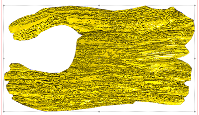
Once the approval was in hand it was time to make the sign real.  I created a relief in EnRoute using the dome relief tool. The dome shape was slight - only 13 degrees. Then I plopped on the wood grain bitmap file and formed the knarly grain. I made it deep (0.4" deep) for this was a piece of driftwood. 

Then I used the virtual sculpting tool to deepen the creases in specific areas as indicated by the red arrows. It didn't take long but the effect was dramatic.
This end view shows how the virtual sculpting tool made these areas deeper and enhanced the wood grain.


Next I outlined the letters and formed flat reliefs. I then drew an irregular curved shape and use this vector with the dome relief tool to modify the reliefs to match the shape of the wood background.

In about twenty minutes I had gone from approved sketch to the finished routing file.

I warmed up the MultiCam and then started the file.  In minutes the sign came to life as the router automatically carved the Precision Board. 


I was busy, taking my grand daughter Phoebe to the local nature preserve as the robotic machine did it's task. When I got back about an hour later the job was done. There is still plenty of hand work to follow. The bird and worm will all be done with the Abracadabra sculpting epoxy. And after that I start in on the paint.

I'll send Tom the link to this post so his mom can look up the progress on the sign on her iPad. She will most likely not understand all the technical stuff but she will appreciate that her sign is in production.

HAPPY 60th ANNIVERSARY!

-grampa dan

Thursday, April 14, 2011

Blue sky progress


Today was one of those days when the world conspires against you doing any actual work that counts. But while the paying work was thin, I did manage to squeeze in a little time on the Blue Sky Project while I was loading some computer programs onto my new laptop. In ten minute bursts of activity I managed to lay on some sculpting epoxy to the gondola. As normally happens the drawings served as a rough guide, but many new ideas worked their way through. I decided the gondola needed more texture and so I sculpted some wood grain into the front. The 'metal' sides wrapped around to hold the wood in place and that was the perfect excuse to put on a bunch of rivets.


The wood in the front was balanced by a wooden barrel out back, making everything much more old fashioned and cool. I'm starting to really get into this thing.  


As I sculpt I forget the whole purpose of the exercise is to build a project that utilized the fourth axis capabilities of the new router... but then again it will be many weeks yet before it arrives, leaving us plenty of time for that aspect of the project.

In the meantime we'll continue to have a little fun.  :)

-dan