WELCOME!

It is hard to believe that it was almost ten years ago I witnessed a CNC router in action for the very first time. I was fascinated and simply had to have one! Although I had been in the creative end of the three dimensional sign business for most of my life I didn't really know what I would do with one of these machines - but I just knew it could do fantastic stuff.

Along with the CNC router I discovered the wonderful material called Precision Board and the glues, primers and other companion products they offer. Since then we have gone through many tons of the material using it in most signs and projects we tackle. This journal will chronicle our many adventures both past, present and future. I'll talk from the perspective of someone who pushes these products to the creative limit on a daily basis. I'll be adding to the stories two or three times each week. -dan

Tuesday, November 27, 2012

Complex pub sign - part four


I forgot to grab screen captures of the small bottom oval but it was a flat relief, modified with a second layer using the dome tool. Then the 'Q' was added to the top of that with a 0.15" height. It was then merged highest with the previous base relief.

Now we are on to the QUEENS lettering. I built the lettering outline as a separate relief. This would be nudged up or down as necessary in the front view at a later point to make sure it was in proper position in relation to the rest of the sign.


The letter outline relief was then modified by adding beveled letters.


Then I nudged the QUEENS relief vertically until I was happy and merged highest with the background relief.


For the upper crown I took my design cues from the lower lettering and the 'qQ' oval. It would look best arched upwards in the middle. To do this I first created a flat relief and then drew an oval vector around it. I would use this vector to modify the crown outline relief in an arc. I nudged it up a tad in the front view to make it look good in relation to the rest of the sign.


Then I modified the crown outline relief by adding the crown. relief


I checked everything with a render and by looking at the front views and then MERGED it highest with the background relief. The pub sign was looking pretty fine! Not much further to go.


The last step was the PLATE lettering and outline Once again to make things easier to adjust as needed I would build it as a separate relief, starting with the lettering outline, then modifying the outline with the letter shapes and lastly with the top decorations - all at 0.15" tall.


Then I merged highest with the background reliefs one last time.


With that the sign was ready for tool pathing and routing.


-dan

Monday, November 26, 2012

Complex pub sign - part three


 With the background of the sign done it was time to start in on the scroll and lettering. While I could have made the scroll all curved the reality was there would only be 0.15" between the layers on the folds... not much room for anything fancy. Dave was more than capable of doing fancy blends with paint to make the sign more dimensional. The scroll pieces would all be built as separate elements one layer at a time and then merged highest with the background at the end. I started by selecting the lowest elements of the scroll and made them 0.8" tall.

Then I worked my way forward keeping in mind what folded over what. There were four layers over all.


In these front views we can see the layers of the scroll stacked up.


Then, when I was satisfied how everything lined up it was time to merge the layers to the sign. First, after opening the merge menu, I selected the background relief.


And then following the prompt I selected each piece of the scroll, one at a time and then merged HIGHEST to the background. I then moved the pieces of the scroll to a new layer and made it inactive. In this way I could keep the pieces intact for Dave. To make sure everything was right I did a render before I moved on.


 Now it was time to move on to the eatery lettering. This needed some special attention to make it work. I kept Dave's original rendered view handy for reference and noted that the end bits of the lettering on each side tucked under the scroll. But the scroll ends were lower than the shield in the center of the sign. This meant the Eatery lettering had to bend upwards. EnRoute is capable of just such a feat by using a special procedure.


To accomplish this task I drew an oval around the work eatery. We would use this to modify the relief later.


First I created a flat relief that was 0.45" tall. This number was a bit of an educated guess on my part as to the height but it worked out in the end.


Once I had the flat relief I then modified he relief by selecting both it and the oval vector I had created previously. A 12 degree slope on the curve also proved to be the magic number in clearing the center shield and sloping down enough on the edges to tuck under the scroll folds. It took me three tries to figure this out. Once I had the lettering background right I added the lettering to this relief.by raising it 0.15" (not shown)


Then, after checking everything in a couple of different views I could merge highest to the background relief.


The sign relief was coming along nicely and showed some great looking dimension.


We'll pause it here for now and then continue in the next post.

-dan

Sunday, November 25, 2012

Complex pub sign - part two


The pub sign started like pretty much every project. I would build a flat relief, in this case 0.4" thick. Everything else would be built on top or added to this basic relief.


The next step was the borders. These vectors were selected along with the original relief and then I modified the original relief by adding to them 0.15" in height. 


The ornate background border was next. It overlapped the border element so I built it as a separate relief. Because so many of the elements overlapped from here on in, we would have to build the rest of the files and separate reliefs and then merge highest to modify the original relief. I first built the fancy design as a separate relief that was 0.7" tall to make it slightly higher than the background and borders. Then I modified this relief by adding the shield shape that was another 0.15" tall.


this fancy shape was then merged highest with the base relief. The two steps for this proceedure are shown below.


And here's the file rendered as it now looks.


So far things have been pretty easy and straight forward but as we get into the file it gets a little more complex. Stay tuned for more next time.

-dan

Complex pub sign - part one


Last week I received a request to build a file for another pub sign for the same fellow I did some for a while back. It is not often I build files that I do not design and route but Dave's work is just so fine and challenging that I find it hard to resist. Dave is in the process of building a new building to house a router of his own. When that happens I know he'll be off and running and we'll see some pretty amazing work in the future. With Dave Barrer's kind permission I will be posting the step by step of building this complex pub routing file.

Like last time he sent me some well crafted and amazing Illustrator files.


Dave asked me to build three versions of the file. He also asked me to keep all the elements of the build separate so he could use them in the future for other projects. This meant I had to learn something new this go around. I would learn about using layers in EnRoute. This would be fun and challenging.


I imported the Illustrator files into EnRoute knowing what would happen. The beautiful blends in Dave's illustrations appeared as black boxes with tight vertical lines. I would need to edit and simplify the vector files considerable before they were usable to create reliefs. Each time I get illustrator files from designers used to working for print I see this kind of thing. It really confused me when I first saw it but now I know what to expect.


Other areas of the design such as the borders and letter outlines also had many extra lines. I carefully went through each area of the file deleting and simplifying the design. In all I spent about an hour making the file usable for routing purposes. This is what I expected from pervious experience.


The file was now ready to begin creating the rather complex design of the sign. I had budgeted four hours for the task of building the relief but it actually took more like six hours before I was done. To do this kind of intricate work requires complete concentration for me. I waited until late in the work day when things quieted down. Then I worked non-stopuntil I was done, save for a couple of quick breaks to walk outside for a breath of fresh air and clear my head. It required the file be built from the bottom up, keeping track of the depths of each piece as the many layers were assembled. The key is to keep going forward, building one element at a time without having to redo any pieces - a task I actually managed to accomplish.


The build of this relief will seem complex without a doubt but in reality it is simply a combination of many of the things I have discussed previously in the blog. For those just starting I would strongly advise not to attempt something this complex until you get a firm grasp on handling files in EnRoute. But for those who like a challenge and have some experience in EnRoute this is the perfect kind of file that will give you a run for your money. Next time we'll begin the process and most likely spread it out over a few posts. 

Stay tuned...

-dan 

Thursday, November 22, 2012

Kel-Mor signs


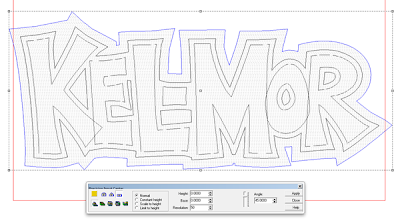
Because the little dump truck is to be paraded out onto the ice between periods at local hockey games it is important that the customer's name be extra large on the side. Lettering on the doors simply wouldn't have worked. I decided some dimensional lettering was a better idea. The MultiCam would do the bulk of the work for this task. I wanted to use a cartoon font and I had built such a font in just the style I wanted to use. It is available at  LETTERHEAD FONTS .  My pet peeve is to see someone use these fonts 'right out of the box'. They beg to be played with, the occasional letter resized or tweaked to make them more playful and work together. I of course always take it one step further. Because the letter style is so familiar to me I like to redraw it each time from scratch - on paper and then quickly digitize it to become a vector. Below is the quick scribble straight from my sketch book.


This was hand traced to become a vector. I tweaked things just a little to satisfy me.


 Then in EnRoute I added an outline.


I added one more outline and this would become my backing board which would be cut from medium density overlay plywood to add structural strength to the cut out Precision Board letters. I would also use this outline to create my routing zero height 'bowl' that would effectively cut out the letters as well.


The letter outline was added to the zero height relief.


Next I used the bevel tool to add the beveled letters.


As quick as that the file was ready for tool pathing.


I ran the file two times - one for each side of the truck.


The backer boards for the sign were cut from double sided half inch medium density overlay using an offset cut.


Here's the sign mocked up before painting.


Matt holds the sign roughly where it will go on the truck. Painted in bright colors is should be plenty readable from anywhere in the arena.


Tonight we'll finish the welding on the box and hopefully the bulk of the sculpting as well meaning there is only paint to be applied after that. We are almost ready for a test drive!

-dan

Sunday, November 18, 2012

Just a few details on the router


On some projects we use our router for only small bits of the whole. A current project, a small dump truck built over a golf cart chassis is a perfect example. The routed portion of the project will be limited to an emblem on the grille and a dimensional sign on each side. It's not much compared to the whole thing but it adds just the same.

As always it starts with a drawing.


The golf cart was in pretty good shape mechanically. We stripped the body off first. If possible I like to keep the mechanicals such as the gas/brake pedals in the stock positions. The steering wheel was relocated to the center and shortened. The floorboards were cut down to allow for a narrow body.


A new frame was built around the old one. The new body is built around this steel frame, leaving the original aluminum one intact. In this shot I'm testing the new seating position.


I then welded a pencil rod framework to shape the new body. Expanded lath was then tied to this framework.


The grill emblem was one of he few pieces of this project that were made on the router. 


A thin layer of sculpting epoxy was pressed over the mesh. It will get another coat which will be carefully sculpted to form all the details and body panels. The box of the truck was built over a sturdy welded steel frame.


The sides of the dump box were built in the same fashion. The photo shows the detailed sculpt of the hood, cowl and start if the detailed grill. This marks the progress to date but in the next few days this project will come together. 


I'll post a few more pictures as we make more progress.

-dan