WELCOME!

It is hard to believe that it was almost ten years ago I witnessed a CNC router in action for the very first time. I was fascinated and simply had to have one! Although I had been in the creative end of the three dimensional sign business for most of my life I didn't really know what I would do with one of these machines - but I just knew it could do fantastic stuff.

Along with the CNC router I discovered the wonderful material called Precision Board and the glues, primers and other companion products they offer. Since then we have gone through many tons of the material using it in most signs and projects we tackle. This journal will chronicle our many adventures both past, present and future. I'll talk from the perspective of someone who pushes these products to the creative limit on a daily basis. I'll be adding to the stories two or three times each week. -dan

Tuesday, November 8, 2016

Pub signs - final pictures

No project is complete they say until all of the paperwork is done. That of course includes documenting the finished pieces with great photographs. The pub signs won't be installed in the project until some moths down the road. Chances are the lighting won't be great and the backgrounds will be busy and cluttered. We'll get pictures then but in the meantime we needed some good ones. The solution was to set up a temporary photo backdrop (two sheets of plywood) and paint it a neutral colour. We then rolled the signs into place, one at a time and took a bunch of pictures with a good quality digital camera. These pictures were then brought into Photoshop and tweaked a little. Lighting and contrast were adjusted, and the images were cropped and adjusted so there was no keystoning. In about an hour we had images of the seven signs that were of great quality.

The Crown & Pin Pub sign is now the marquee for the establishment. Very different on both sides it still looks great from any angle.


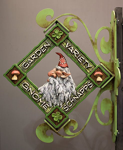
The Garden Gnome sign makes me smile. I'm not generally a big fan of the color green but it certainly is the perfect choice for this sign. The two sides of the sign are similar but not at all identical. It would be hard to pick a favourite.


Peter designed the Moon Wine sign and did an awesome job. He cleverly used dimension to make it work well from both sides.


The Trolls Bitter Ale sign is one of those pieces that is so ugly its cute. The colours Becke picked are fittingly gundgy. It's a classic.


The Forest Lady sign is pure class and elegance - as it should be. The colours are muted and earthy. The welded steel bracket defies description and reminds me of a regal set of feet antlers. 


The Toad Stool Elixir sign was great fun. The 23K gold leaf on the lettering adds some serious bling to an earthy and well aged sign.


The Merry Dragon Pub sign was also a great deal of fun. My goal was to create a sign that looked to be a hundred years old with a baby dragon perched on top. This sign is a piece of high contrast as it sparkles brightly and yet sports a well worn age.