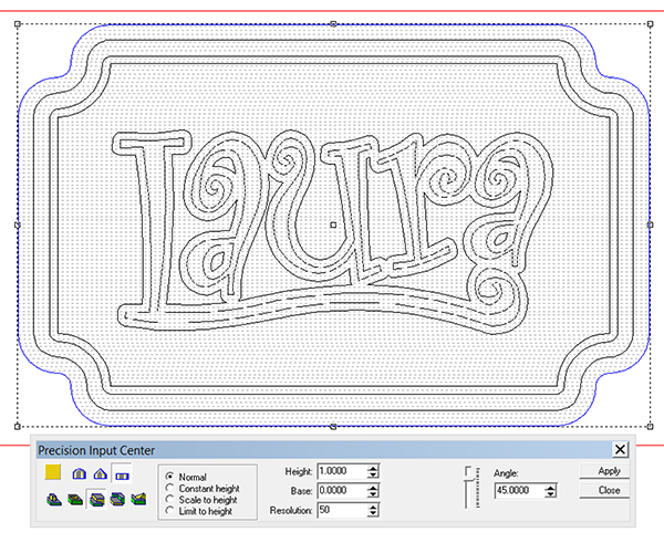
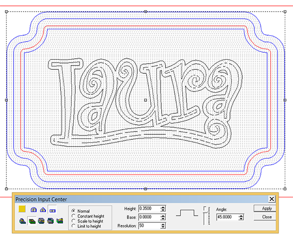
Our painting crew always enjoys painting a more feminine name plaque. These days our workshops have more ladies in attendance and so I happily oblige. For Laura I picked a font called curlicues. I modified the letters to fit in with an elongated 'L'. A suitable border for the plaque was designed in EnRoute. Then the outside vector was selected to create the base relief.
The inside was dropped but with the inside pinstripe border selected so it remained the same height as the outside frame.
Then using the same vectors I applied the background texture.
Then I drew up a new vector shape as I wanted to dome the lettering.
The first step was to create a flat relief using the lettering border vector.
I then modified this relief using the pill shaped vector and the dome tool.
In the front view I checked how this new relief was positioned in relation to the base relief. I nudged it up to suit my taste.
Then I merged it (highest) with the base relief.
I then modified this combined relief by adding the lettering.
It was then ready to tool path and send off the the router.


