I love new and original challenges when we make a sign. Generally as I design the concept drawing I have a vague idea of how we are going to build it - just enough to not lose any sleep. The actual figuring out of how we will accomplish this is left until we begin work and not a minute before. That's what makes my work so much fun!
For this project we started with a client's design for a new ride in a theme park. Most often we insist on creating our own artwork but this was fun and quirky enough to go ahead as is - save for some color switches. The vectors were ready to go minus the drop shadow on the lettering and white highlights on the dots. To get rid of those we just had to delete those vectors.
The client wants a fun but natural looking theme. We went with mechanical bugs and added some gnarly trees. I wanted the sign to look like a cloth banner, but it needed to be tough and look good for decades. I also wanted the letters to be dimensional. That meant we would route the sign from 30 lb Precision Board and imbed a steel frame in the middle for strength. Somewhere in it's lifetime someone is bound to do some chin-ups or climb up for a selfie. It's always better to be safe than sorry.
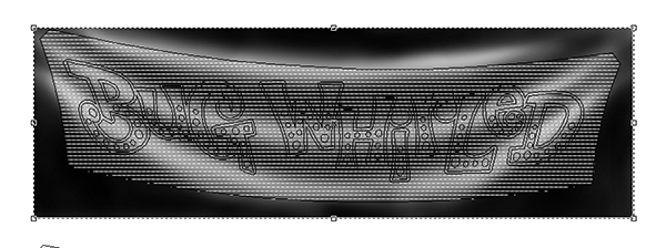
I imported the lettering and quickly drew up a banner shape. Notice the lettering although plenty fun does not droop like the banner.
Luckily the latest version of EnRoute has a handy dandy warp tool (transform) to do the warping for me. I selected it and then opened the warp took. It is a simple matter of grabbing the handles and adjusting things until I was happy.
Then hit enter to see what the final result looked like. I was happy! I added a couple more nodes and adjusted the corners of the banner.
I duplicated the banner and created a cutout for the structural steel which would be laminated inside. As a last step I created an outline around the letters using the offset tool.
I wanted the fabric of the banner to wrinkle up a bit to look like it was being suspended by the top corners. To do this I opened a screen shot of the banner outline in Photoshop and then created a quick bitmap. As always I thought about how the bitmap would work inside EnRoute. White raised - black does nothing and greys react somewhere in between - depending on their value. I knew a blended bitmap should work pretty good.
Once I had the bitmap in hand I created a flat relief in EnRoute.
I then imported the bitmap and located it over my relief. I assigned a value of .75". This meant the white areas of my bitmap would raise that location by .75" and the black would do nothing. I hit enter and then the render button to see it my plan worked...
It worked perfectly!
I then modified this relief by raising the area around the letters.
I modified the relief two more times with the lettering and dot vectors. Everything perfectly followed the contours of the folded banner. I love it when a plan comes together! :) I can hardly wait to see it routed!


